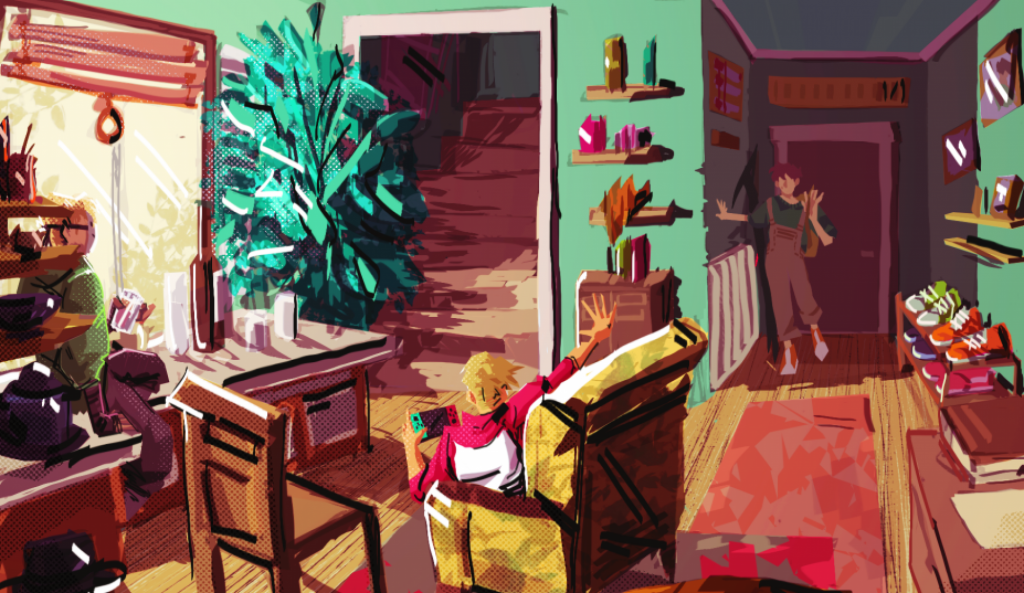
Objects that are important to me, the value they hold, stories they tell.and how I view them.
>Shoes – Gift from my aunt, perfect companion traveling different terrains of life. While wearing them, I am not only experiencing the places I visit but also leave a footprint, both literal and figurative.
Headphones – auditory experience. Observation through music, through sound, through voices.
>Plushie, a personal gift from a dear friend – Connection with friends, hand-made, reminder that there are people who are waiting for me back home. It was made with the intent to portray how she sees me and compares it to a cat.
>Glasses – Lets me observe the world and surroundings, see things as they are, or as they could be.
>Backpack – security/emergency bag. It is a trusty companion in my day-to-day life. It pockets everything I need when I leave my comfort space – home. It carries things I need and sometimes I forget about them being there. That is why it’s always ready to provide me with the required gear.
>Hands – they are not only the primary way to express my creativity but also a connection to the world through touch. They let you feel and experience the world, not only observe it. Touches, hugs, holds are shared connections and support for the people involved.
Shoes
Headphones
Plushie
Glasses
Back pack
Hands
People important to me
How do these people see you?
>LAISVIDAS – mono-worker, mediator, ambitious, peacemaker, independent, disciplined. Hard-ass from the outside.
>EMILIS – humble, creative, modest, literal.
>MUM – determined to succeed. In need to learn to appreciate the time given and use it responsibly.
>TINA – the person who knows what self-love is. True and not sugarcoating,
>MIRA – a calm an collected, reminding of the cozy winter.
>URTE – multidimensional, liquid, flowing personality, doesn’t fit into a set mold. Always changing and evolving.
Brother Laisvidas
Brother Emilis
Mum
Tina
Mira
Urte
TRACEY EMIN Object-Artist <Group presentation>
Tracey Emin used her own story, experiences, herself as a piece of art. She did not shy away from uncomfortable topics. She embraced them, reshaped, and used them to tell her story. Using personal joys and struggles to fuel creativity and be a remaining legacy for people to feel noticed or pay attention to.
Tracey Emin The Perfect Place to Grow 2001
Cultural Identity – The way you perceive and identify yourself as a part of multiple cultural communities. It can include age, gender, sexuality, heritage, interests, family, historical identity, personal experiences, etc.
Throughout this whole Introduction to Animation unit, we were asked what is (or is not) animation, book, sound. How we perceive and understand these phrases, what is my own take on them.
Who am I?
What is book?
My journey working on this project began by asking myself a (not so) simple question: what is a book? What can be or can not be considered a book? The closest description of a book I discovered that I agreed with was: its purpose is to tell a story. No matter the format, narrative flow or lack thereof, it can be a book as long as there are some elements leading to the semblance of evidence of the existing deeper meaning. I see ‘book’ as a term for holding a collection of stories. Book – a collection of stories.
Format of the book
And it started moving from there. The traditional bookbinding, ancient as the paper itself. But I wanted to move away from it. Experiment and find a new way to interpret the format of it.
I am fascinated by the art of origami. The power that is granted to take a blank piece of paper and without and other instruments, just your hands, bring this piece to life in the form of a creature or other fascinating object. While looking into using origami for my project, I found the shape – Icosahedron, 20 sided polyhedron to work with. I decided to choose it as a format and template for my book.
I knew that we need to make 12 pages, I converted that into 12 topics to cover for my book. Them being:
Loss
Empathy
Home
Love
Family
Artist
Community
Culture
Shadow
Animus
Persona
Fate, Chance and choice
YOU ARE HERE
My final project was built on the main idea of identity – I am a multidimensional individual both fragment and the whole. I consist of so many pieces, both compatible and contradicting, but still, they manage to keep me whole and let build upon them as both individual and artist.
I wanted to touch upon 4 Jungian Archetypes while talking about identity and inner world.
PAGES
Artist – storyteller. A person who tells their own or other people stories through their medium. I have stumbled on the interesting word SONDER – the realization that each random passerby is living a life as vivid and complex as your own. The definition of this word was created by John Koenig who wrote the dictionary of obscure sorrows’.
Home – people I want to go back to. It is the people who make the house feel like home. Home is not the place where I sleep or four walls I pay rent for every month. It is the space I feel safe, protected, and where I can let my true self be released without any judgement.
Empathy – the feeling of connecting with a person on an emotional level. I view it as a blessing and a curse. It lets me build an emotional connection with people quicker based on mutual understanding and eagerness to see from others perspective. But it further entails the need to find justification for an action. I catch myself justifying other people toxic behaviour because I can imagine seeing from their perspective. Having too much empathy unwillingly makes me feel bound and tied to different perspectives and overthink everything.
Loss – I see loss as a painful beginning. Loss affects not dead or lost, but living and found. It’s the feeling of never getting it back and learning to move on without it. One of those lessons came in the form of my mother passing away. ”Don’t waste your time. Use it.” The words my brother told me after the funeral. It’s important to acknowledge the loss but it’s more important to take the lesson and learn to move from the past.
Love – As an Ace/Aro person I don’t define love as a sexual attraction. Love has so many forms. Love is a connection, like a new sword, that gets stronger after each dip into the water of challenges misunderstanding, trust, hustle. It is work put in that strengthens it and makes it worthwhile.
Family – people that define home. My brothers that let me grow and flourish, The blood family that raised me and put the cornerstone of my beginning. Ties that we hold and connections that I make is not defined by my blood. Family is the body that I feel safe, supported and willing to grow myself.
Community – as I woman young adult and student, the need of like-minded people is prominant. It’s important to belong somewhere but I am not entitled to define myself my everyone’s standards or agree on everyone’s positioons. What is important is the want to grow, better yourself, understand others .
Culture – as a Lithuanian I feel the need to define myself as such. I see myself as an extension of the culture I grew up in. Not so much as kitchen or folk culture, but the mentality and historical upbringing of our country. The moral compass I inherited through my family as well as from the place is important and defines part of me too.
Shadow – based on the Jungian archetypes, the shadow is the part of the unconsciousness that is our darkest instincts and desires that aren’t accepted by the society we live in or by the person themselves. I am more thrilled by the implication of different look at yourself and finding what describes you in shadow is interestiong.
Animus – based on the Jungian archetypes, the animus is the masculine part of the woman, as Anima is the feminine part of the man. It is important to discover and take time to accept all part of our individuality as equal no matter what society tries to force on the individual. It’s needed to know myself because no one knows myself better than I do.
Persona – based on the Jungian archetypes , Persona is the way we act while interacting with different people or groups. It is mask we put on to seem more aproachable, more friendly, intimidating, confidant. The way we want to present ourself. It is imortant to distinct yourself from your true you and the character you play. Water
Fate, Chance and choice – I am not in control of my whole life span. I can change some things, make desitions and plans, but it is never in hands to decide what will happen to someone else in some unindentified period of time. It is important to learn and find your own way to deal with it.
The 20 sided polyhedron is the representation of YOU ARE HERE, my outside and inside. Each piece of this 3D puzzle is unique and if deconstructed and put into the right order it reveals a short animation sequence. It is a short clip – representation of my soul. You can delve into each piece of me separately, but only if you put the pieces together, the map of my soul will become visible to you.
(Disk, the driver, is the soul. It’s, as the name entails, the one who drives, runs our body, as the program driver run the computer.)
my book is like a vault. It is closed, guarded. But even if it’s open, the only way to truly know the meaning of all the pages is to decipher and connect. Throughout outside panels, there are morse codes scattered around.
Critical appraisal
Throughout the introduction to animation unit, I was given many opportunities to not only broaden my knowledge but also rethink and reevaluate how I experience and appreciate artists and their work. Throughout the practical homework and discussions in lectures, I had slowly developed the base concept of my final project of this unit.
The base of the concept is held by the idea of ”I as multifaceted fragmented being, undefined and uncontained”. My goal was to show many different parts of myself, how even if they contradictory, it does not mean they aren’t able to exist together in one. By taking inspiration from such creators such as Shioto Chiharu, Tracey Emin and storyteller Mattew Mercer, I used it to blend my experiences, thoughts, feelings into this project. I want to show my point of view on myself, my identity, who I am, and then I AM HERE.
I wanted this project to be as meaningful and as personal as I was able to make it. With this notion, I dedicated time to observe my surroundings, my own artistic lense, how I am able to perceive what surrounds me, without the invasive perception of the stereotypes or foreign biases. To know yourself is to know your own bias and question it constantly.
Through the whole time I spent on my book, I learned to focus more on myself, who I am, got to know myself a little bit better. I wanted to get to know myself as raw as I could, without anyone’s intervention. Who I am as a person, as an artist, as an individual.
I perceive myself as a liquid, water. It flows where ever it wants, can change forms depending on its surrounding environment, can shape itself however it wants but always will stay the same liquid after. I adopted this mindset because I believe that everything and everyone is evolving not depended on the wants to do so or not. It is in my power to take my past, experiences, failures or success, moulding into what I want to be despite opposition. Because I know myself the best and I am responsible for it and my place in this huge scheme we call existance
The third, the last, week of this rotation started by studying and understanding the ‘normal’ walk cycle and the on our own head turn while deciding our own timing and spacing.
PRACTISE EXERCISE: WALK CYCLE
‘Normal’ walk cycle is achieved by drawing contact, down, pass position, up pose frames for a single step and then tracing them but changing legs and hands positions.
The exercise started by drawing the simple figure and setting correct positions for leg movement, without and hands yet.
Keyframes with basic breakdowns
Second stage – adding hand movements and more in-betweens. I struggled a bit with keeping arm’s length consistent but then I started using marks on the figure’s torso to help me indicate the arc of the moving elbow.
More in-betweens and added arms movement
After that, final in-betweens were the only ones left for me to do for the first step of the walk cycle.
Finished first step
Using the first step’s frames as a guideline, I traced the shape of the figure and changed the arms and legs positions. By doing this, I completed the full walk cycle!
Completed walk cycle
I decided to add a character on top of it. With very small secondary action in his ponytail.
Character walk cycle
PRACTISE EXERCISE: HEAD TURN
The second exercise of the week – head turn. From the start, I spent good two hours designing and figuring the story, the action, the timing. It was the first time while in this workshop that I had a chance to work with my own timing.
I wanted to make a character with the hat as his prominent design feature. I wanted him to be some sort of traveler, explorer. With longer hair braded and tied for conviniece sake. I added some details to indicate his scruffness such as uneven hat lining, few scars and one braid being shorter than the other, cut or sliced when he was escaping from something perhaps.
Character designs
For his head turn I wanted to start from him having a pleasant conversation, and perhaps hearing someone yelling his name, he turns around without any hurry and notices a dark menacing cloud of smoke approaching. The face of surprise and shock.
Further character designs and key poses
By using the head structure, I made a simplified head turn with only keyframes to find the correct arc of movement for the head to follow.
keyframesAdded in-betweens
After determining the timing and spacing for the structure, I started adding details and facial expressions. Also, because it was one of the points in the brief we received for this workshop, secondary action in hair braids and ponytail.
The second week of Paperwork rotation. The main principles of focus this week: Arc of motion, Timing and Spacing, Squash and stretch.
First thing first, to understand how these principles work, we were instructed to use basic shape – a ball. It is a very basic object, but it provides great means to understand more complicated principles easier.
PRACTISE EXERCISE: BOUNCING CHARACTER
On the separate piece of paper, I made my motion arc. And then, by using provided examples of timing and spacing in the workshop brief, I made my frame guide, to know approximately the location of each frame and number of frames needed.
Arc of motion
And then time came to use stright ahead animation to complete the bounce and line test it.
Bouncing ball – line test
When the bouncing ball line test came out satisfactory, i moved on to adding characterisitcs to the ball and molding it into a character, a simple one-eyed owl-like creature.
While working on it, I also had to think about secondary action because of the added features such as flippers and tail. The reaction and emotional response of the character was on my mind as well. My idea was to make character express his emotions through his eye.
PRACTISE EXCERCISE: DEBATING CHARACTER
The second exercise of this week was debating character. It is a great way to familiarise myself more with animation chart and learn how to ease in and ease out works and looks.
First step – simple character design.
I focused on the idea of political figure time of a person, maybe rebel leader type of deal. He covers his face with a face mask and his eyes are usually covered by his hair. I fancied the idea of him having some sort of headpiece for design purposes but also symbolising his role. I gave him a small crown type headpiece, more similar to the paper crown from the Christmas cracker than the real crown. In his sort of way to symbolise his position, not that of monarch or dictator.
Character and pose sketches
It is time to more on to key frames and breakdowns for the character animation
Character animation – key frames and breakdowns
And then it’s time for in-betweens and some added shadow details.
Character animation
Character animation was a tad more challenging than facial expressions morphing or bouncing ball. It made me pay more focus to the natural movement of a person while working out the breakdowns, to give it a logical flow. I enjoyed the opportunity to design more characters this week. And learn principles while using it practically from the start really puts its usefulness in perspective.
This week was the start of a new rotation: Animation Arts: Paperwork.
The goal of this rotation is to familiarise ourselves with 2D animation, understand the vocabulary used in industry, introduce us to the lightbox, and how paper animation is made through a series of workshops.
Before starting any practical work, it was important to understand theory first. The timing of the animation, frame rate, difference between working on ones and on twos, and, of course, principles and usage instructions of the lightbox.
PRACTISE: STRAIGHT AHEAD ANIMATION
We kicked off with straight-ahead animation. By animating on twos, I created this transformation animation.
Homework 1: Straight ahead animation practise
I tried to draw actions as fluid and smooth as possible while moving lines from one creature to the other. I got inspired by the object transformation using similarities between silhouettes. That way creating a more seamless and fluid metamorphosis.
PRACTISE: POSE TO POSE ANIMATION
The next lecture was an introduction to a different way of animating: Pose to pose. Understanding timing charts, the differences between keyframe (extreme pose), breakdown frames, and in-between frames. Then moving on to simple characters and creating three key facial expression poses. After it is done, finish the animation sequence using the pose to pose animation.
Homework 2: Pose to pose animation progress
While working on it, the biggest difference I took note of was the planning aspect of animation. I have to think and visualise the whole animation before hand starting pose to pose, while straight ahead animation is more ”go with the flow”, more fluid.
Homework 2: Pose to pose animation combined with straight ahead animated background
TOPSY TURVY – is used to describe being upside-down, head over heels, confused or disordered, not tidy or neat, and in a state of disarray; the opposite.
Questions for idea generation:
> What if the world would have upside-down gravity? > What if the water was used as a fire instead? > Synesthesia concept? > Subverted expectations?
Mind map
LOGLINE – Creature, The Angler, chases down the prey, but the true preditor is not what it seems
SYNOPSIS – The Angler obliviously follows the prey, not noticing the terrified pursue, When The Angler catches up to it, it towers over them but doesn’t do anything. The light Spark that follows Angler swallows it when Angler is not looking.
Character design sketches
The Angler
For the design of The Angler, I wanted to implement Anglerfish’s luminescent headlight, Spark, as a design element and one of the light sources of the scene. But I didn’t know what kind of stature would this creature have. After playing with some different designs, I reduced the pool of options into a few key characteristics I wanted to be part of the final design:
eyes below the mouth;
uncommon number of eyes;
monster/mountain-like stature;
belly mouth
Spark
It is a sentient creature that has a symbiotic, borderline parasitic relationship with The Angler. It takes over The Angler species’ body and uses it for hunting purpose. When the prey can not run away anymore, the Spark strikes. It is borderline parasitic because based on established involuntary connection, The Angler host is provided with nutrition from the hunts, but after a while, the controlled link weakens the host.
The hosts can be identified by their eyes changing colour. They become the same colour as their spark parasite.
The prey
For its design, I wanted to make it into a small creature living in a forest type environment. Small enough to hide among the leaves and moss. It has a mossy cloak to blend in too. Main characteristics:
one eye;
mossy cloak;
stick-like horns;
no arms.
The colour of the mossy cloak is the same as the patches on The Angler. It is no coincidence. While hunting, the Spark on The Angler’s head can’t digest the moss. In this circumstance, it just grows one The Angler overtime.
Final designs
Final designs with colour and colour variations.
Turn-arounds and size
Inspirations
The Manananggal (“self-segmenter”) is a Filipino Aswang (evil spirit) that detaches her torso from her lower half and then takes flight during the night to hunt. I wanted to use the separation concept, how two merge into one or reverse.
I approached this project with an attitude of creating and designing something with knowledge of doing the best I could with the skills I have. I wanted to make something that I could learn from. And I will say: I learned a lot.
From the beginning, I struggled to come up with an idea for the overall concept of Topsy Turvy. But then the idea of using Anglerfish as an inspiration came and I started developing concepts much quicker. My goal was to not only create a storyline but build the world too. I wanted to showcase this cavern forest, where light is emanating through bioluminescent tree barks, the moss hides little creatures from their preditors, big and small.
Designing the character was challenging but fun. I used shape language to enhance them, size differences to guide the narrative. I didn’t want to make their designs complicated, I stuck to the simpler forms. But I regard them as a great fit for the story I was set to tell.
After all frames for animatic were done, the editing and soundscaping took place. After watching the documentaries and works of the foley artists, I was inspired to challenge myself to create foley sounds at home. I hadn’t had any experience in creating sound, only music. But I experimented with different materials and approaches and then I messed with them in Audacity to create the foley I envisioned in my head. I perceive my foley as an amateur and made with no beforehand experience, which is true, my I really enjoy how it enhances the world I created and makes it a little more believable.
I learned a lot while working on the project, I accomplished what I was set to do. I recognised that my research methods are still flawed, sometimes I just don’t bother to dive deeper into it. It was a hustle to not skip steps of the planning stages how I am used to while working on personal projects. I found myself restraining and burying this instinct as much as I could. Overall I am satisfied with my progress, the narrative and the world I set out to create.
For this VFX cinemagraph storyboard project, I decided to explore themes circling around being alone, isolation, silence. With the events through the whole of 2020, world-wide and personal, I wanted to tell my own experiences regarding this matter.
While we are in progress of the second lockdown, and with online learning in place, I have observed the time I have spent alone. And truth be told, that is a lot of time.
What I noticed was that even if I was completely alone, I didn’t feel lonely. I have assignments to do and lectures to attend, sure, but the time I spend with only myself helped me get to know myself a bit better.
While being in solitude, my interests were always on the top of my list. With no expectations from others, the boldness to try and giddiness to fail and learn from it was reheated. The self-reflection and self-expression became my main priority, to go and discover yourself.
The idea of taking isolation, loneliness, caged up feelings, and emotions and making them turn, evolve into freeing solitude, opportunities for self-discovery, and comfortable silence. I want to illustrate this transformation in my cinemagraph project.
I want to use the lighting to create an airy, safe, comforting feeling, to establish a separation between the outside (busy streets, train tracks), and inside (comfort bubble, personalized space).
The mood board of the cinemagraphs
The sketches around the concept of being alone, but not lonely. I used them to generate some basic shot ideas as well as bits of animations I could put in.
A few shot ideas and their sketches with the action for cinemagraphs
Experiments with photography
After thinking and sketching out the general ideas of the shots, I moved on to the photography side of the assignment. Trying to get a hang of the manual settings and experiment with them.
While working on the general concept, I started to think about the negative and positive sides of being alone. I have noticed from my own experiences the transformation from being lonely to enjoyable and peaceful solitude.
To move on, I defined the progression steps, stages I want to explore:
Loneliness/isolation – silhouetted figure near the window, staring while the train passes by.
Frustration/creative block – empty page/sketchbook, the table is full of mess and discarded paper.
Reflection – reflection in the mirror opens its hand where an origami bird is sitting.
Self-expression/comfort – a cup of tea, full pages of a sketchbook, comfort through familiar spaces.
The shots will be getting brighter and more vibrant as shots progress to show the transformation, acceptance of the situation.
After the ”Reflection” I want to put origami cranes in the shots, to symbolize the silent presence of a companion. To show how the connections and relationships can still be strong and felt even if the distance of separation is huge.
STORYBOARD
Raw footage / screenshots
PRODUCTION / EDITING
After completing and compiling raw clip material for production, I moved on to learning the basic functions and features of NUKE. The nodes mechanics were challenging to get a grip on at first. The biggest struggle I experienced while producing cinemagraphs was drawing masks while keeping an eye on the shadows for them to look natural. But overall working with NUKE was enlightening and I am intrigued by its other mechanics that could be efficiently used while producing other projects.
FINAL RENDER SCREENSHOTS
I decided to put a black and white filter on the first part of the project to enhance the transition, the break that happens after the ”REFLECTION” shot. My goal was to stress the contrast, emphasize the metamorphosis that shapes throughout the clip. By adding chromatic aberrations I wanted to create an eerie, unsettling feeling, isolation, and separation.
CRITICAL APPRAISAL
Through the whole process, I set the goal for myself: to realize my concept and acquire as much knowledge about visual effects, theoretical and practical sides of it. And I am pretty happy with the outcome that I managed to produce with a given time frame and limited beginner’s skills regarding the subject.
The beginning – concept generation – was a tricky part to start with. I knew I wanted to produce something that would reflect my personal view on the chosen subject, but the general concept came only after researching and looking for inspiration, creating a mood board. After that, expanding the concept and making a storyboard out of it was quite fun and intriguing.
Production stage – filming the clips. I am satisfied with the composition aspect of the shots and the movements I managed to capture. However, I knew that I am not as proficient or skilled in the art of photography yet. For the next time, I would make myself take an even more daring approach to cinematography: use more experimental exposure, try to further myself from my comfort settings and concepts even more.
Post-production – creating cinemagraphs and editing. The stage of creating cinemagraphs was probably the shortest. By watching and following the tutorials provided, I managed to get a grip on basic compositing tools in NUKE and create my cinemagraphs without much hustle. While editing I modified the clips to have a saturation shift through the whole project. To emphasize the point where peaceful solitude bleeds into constricting loneliness, conceptual shift. After some debating, I made a choice to cut out the last frame. It didn’t look right and the concept of it wasn’t communicated clearly. Additionally, I add audio to the clips. They all are connected through the noises of outside transport and by using it I wanted to establish unchanged physical space.
Coming to conclusion, I am proud of what I managed to achieve, even if my personal constrictions stopped me from trying a more daring approach. I had fun working on my A(LONEly) concept and its realization from beginning till the end.
The first steps of this 3D modeling project were contextual. Before doing anything the idea has to develop first. The environment has to tell a story, objects put in are part of the narrative and the concept has to mirror it.
Concept emerged using random ideas generating task: ‘What if?’ questions. Here are my five base ideas.
What if:
The forests have nature spirits living in them?
People are living inside the trees?
After the apocalypse nature is taking back cities?
Humans went extinct?
The nature is created through synthetic methods?
WHAT IF HUMANS WENT EXTINCT?
What would happen if, after a disastrous event, humanity is no longer safe? One wave after another, it starts to burn out, can control inevitable end no longer. Sooner rather than later, people-operated and maintained services, systems, providing living necessities, and built monuments start to fall into disrepair. Without constant maintenance, wilderness naturally retaking what from the start was its.
<After the extinction:>
>Without maintenance, buildings start to crumble. Stems and roots start sprouting and crawling through pavement, moss, vines, ivy invade abandoned houses and tunnels.
>Pipes start to rust, electrical lines and wires break.
>Animals are moving into cities.
>Underground tunnels are decaying, falling into disrepair.
>Underground water corrodes the metal constructions holding transport tunnels. Without maintenance, transport tunnels are sure to collapse. The rivers form from sewers water and flow through the craters in the middle of the city.
Reference board
Rough thumbnails
<Final thumbnail and concept sketch>
The central concept of the piece is an Underground exit – stairs leading outside, but what is above remains unknown.
The few indicators of humanity’s touch remain rusted barrels, now overgrown piles of discarded cans, bottles, pieces of dirty fabric, broken signs.
Moss, vines, other plants are so slowly but persistently reclaiming this tunnel.
It looks like someone or something made it their temporary hideout in here, but abandoned it in a hurry.
On the stairway walls, a few aged, crumpled posters are still hanging.
<3D modelling: Blockout>
Because of the previous experience, the start wasn’t incredibly difficult. Mapping out the models and doing research on the real-life sizes of the models – is what took the longest.
As far as I am aware, the experience of working in a 3D environment is a strong positive. Working on this project forces my mindset to see an object simplified into its most basic shapes. It is a great practice and skill familiarization and adaptation for my future creative career.
WEEK 2 | Colour and Lighting
This week I finished my essential modelling and sculpting, added more detail, and moved on to colouring and lighting the scene.
Final model
<World setting>
I knew my scene takes place on post-apocalyptic Earth, in an abandoned city, down beneath the surface. The world after a disaster is abandoned, with no living humanoid creature for miles. Almost a ghost town. The only sounds heard are ambient noises: wind, water, slowly decaying creaking constructions, creature noises. Although the disaster wiped the majority of the human population outright, few managed to border themselves, hiding down in the sewers, underground tunnels, and lower basements. My final piece is going to be one of these places: an abandoned underground tunnel, previously occupied by a survivor.
It’s a lonely existence for the traveller, one of the only survivors of the disaster. Lonely and extremely dangerous too. You never know what is waiting around the corner in this new deserted and irreversible world.
<Base colour>
The scene is earth-toned with few touches of greenery for overgrown creases, indents in the walls, and metallic for pipes and wires.
<Scene Lighting>
At the start, I did some colour tests and experiments before moving into the scene, to really catch the right mood for the scene.
Lighting colour palette variations
My aim is to make the scene be perceived as two different world sides bleeding into each other. That is why I am making a choice to use complementary coloured lighting. The sunset light from outside, deep warm orange/red, falls onto the stairs and into a dull cavern of a tunnel, lit by cool aqua blue coloured solar-powered LEDs.
Colour mood board
<Light saurces>
>Key light (Orange/red): The brightest light source is outside, setting sun, drowning the abandoned buildings, and cavernous areas in its warmth and light. Through the open entrance, sunset is streaming down the stairs into the bunker/tunnel. The traveller didn’t close the gate when they decided to leave their safety and go up to explore the surface. The door is left open.
>Fill light (Teal): Light source is behind the camera, diagonally from stairs. It is streaming from a makeshift workstation’s solar-powered LED lamps. They drown cavern in cool, mechanical light.
>Exit sign above the entrance also creates lime green light. It is the weakest source in the scene, marks the exit of the cavern. It flickers constantly.
Scene lighting
With the guidance of the given tutorials, I had first-hand experience working with lighting. At first, it provided a challenge to figure out the operating functions and the balance between direction and the power of light.
I have never lit a modelled scene before, hence seeing a fully lit scene made by me, left me a bit awestruck.
The colour palette, too, was a great opportunity to experiment using Photoshop and directly in the modelling environment.
Overall, I am satisfied with my progress so far. This week exceptionally, working on it sparked the story around this place, which made me put more thought into the worldbuilding aspect of it.
WEEK 3 | Animation and Rendering
Last week working on this project! It was time to add animation and shape it into a moving piece of art.
I will say: it was a real hustle to figure some of the animation mechanics in Blender. I took some time to find a way to make greenery move at least somewhat naturally. It was important on my end to make it subtle but visible and natural at the same time. I finally achieved it by using the ”Displace” Modifier and using the ”Clouds” texture. The overall look is satisfactory, although next time I would try to make it more realistic.
The few other pieces of animation, for instance, rats running across the pipeline, passing figures, and swaying electrical wires were easier and quicker to accomplish.
The flickering exit sign was achieved by using the ”F-Curve Modifier” Key and choosing ”Noise”. And then by manipulating the curve, the flicker was copied a few times made into a four-cycle repetition. Lighting animation and manipulation took more time to get a hold of, but it was worth it for a better result.
For the camera movement, two different variations were made for comparison. One zooming in and another zooming out.
The final step – rendering – took longer than anticipated. It was partially my fault: the preference of a keyframe interval was set for the highest quality. And that made the rendering crash a few times. But after changing and tweaking it, the rendering went as planned.
While working on it, it presented challenges to study and work consciously using the stages of production. It made me observe the project at hand with a more complex and multifaceted approach. To dedicate time to polish and work on ideas, not to jump straight into production on impulse.
This project helped me develop rudimentary 3D modelling and animation skills and valuable theoretical knowledge. Step-by-step instructions and techniques taught were straightforward, easily applied from the learning exercise to the project.
Overall, I am satisfied with the final results of the projects. Working on a similar project I would differentiate and randomize props more, such as plants or rocks. Furthermore, I am looking forward to exploring more organic props modelling and studying the features of a 3D modelling and Animation branch.
Objects that are important to me, the value they hold, stories they tell.and how I view them.
>Shoes – Gift from my aunt, perfect companion traveling different terrains of life. While wearing them, I am not only experiencing the places I visit but also leave a footprint, both literal and figurative.
Headphones – auditory experience. Observation through music, through sound, through voices.
>Plushie, a personal gift from a dear friend – Connection with friends, hand-made, reminder that there are people who are waiting for me back home. It was made with the intent to portray how she sees me and compares it to a cat.
>Glasses – Lets me observe the world and surroundings, see things as they are, or as they could be.
>Backpack – security/emergency bag. It is a trusty companion in my day-to-day life. It pockets everything I need when I leave my comfort space – home. It carries things I need and sometimes I forget about them being there. That is why it’s always ready to provide me with the required gear.
>Hands – they are not only the primary way to express my creativity but also a connection to the world through touch. They let you feel and experience the world, not only observe it. Touches, hugs, holds are shared connections and support for the people involved.
Shoes
Headphones
Plushie
Glasses
Back pack
Hands
People important to me
How do these people see you?
>LAISVIDAS – mono-worker, mediator, ambitious, peacemaker, independent, disciplined. Hard-ass from the outside.
>EMILIS – humble, creative, modest, literal.
>MUM – determined to succeed. In need to learn to appreciate the time given and use it responsibly.
>TINA – the person who knows what self-love is. True and not sugarcoating,
>MIRA – a calm an collected, reminding of the cozy winter.
>URTE – multidimensional, liquid, flowing personality, doesn’t fit into a set mold. Always changing and evolving.
Brother Laisvidas
Brother Emilis
Mum
Tina
Mira
Urte
TRACEY EMIN Object-Artist <Group presentation>
Tracey Emin used her own story, experiences, herself as a piece of art. She did not shy away from uncomfortable topics. She embraced them, reshaped, and used them to tell her story. Using personal joys and struggles to fuel creativity and be a remaining legacy for people to feel noticed or pay attention to.
Tracey Emin The Perfect Place to Grow 2001
Cultural Identity – The way you perceive and identify yourself as a part of multiple cultural communities. It can include age, gender, sexuality, heritage, interests, family, historical identity, personal experiences, etc.